Artesastore

Proyecto Artesastore

Project Overview

Artesastore is an e-commerce website designed for a client selling Colombian artisan products. The project focused on creating a shopping experience that feels clear, approachable, and trustworthy despite relying on WhatsApp instead of a traditional in-site checkout.

A key challenge was helping users understand how the purchase process works and what to expect after interacting with purchase actions, reducing uncertainty and hesitation along the journey.

I designed the full UI and interactive prototype and implemented the final experience using custom CSS and JavaScript.

Problems Detected

Expectations Mismatch

The primary purchase CTA implied a conventional in-site checkout experience. However, because the actual process continued through WhatsApp, this created a mismatch between what users expected and what happened next, increasing confusion and uncertainty during the purchase journey.

Conversion Friction

Redirecting users outside the website without enough context introduced hesitation at a critical moment in the experience. Without clear signals about the next step, users could lose confidence or abandon the process before making contact.

Ideation & Direction

Early explorations considered engagement-oriented features such as notifications and group interactions to encourage activity and participation. However, because the experience revolved around a straightforward purchase flow and an external messaging process, these additions risked introducing unnecessary complexity.

As the direction evolved, the focus shifted toward simplicity, predictability, and clarity. Rather than expanding functionality, the experience was intentionally streamlined into a more guided flow that helps users understand the process and confidently move toward contact.

Mi foto del diseño

Information Architecture

The information architecture was intentionally structured around a simple and guided purchasing journey designed to reduce friction and make each step feel predictable.

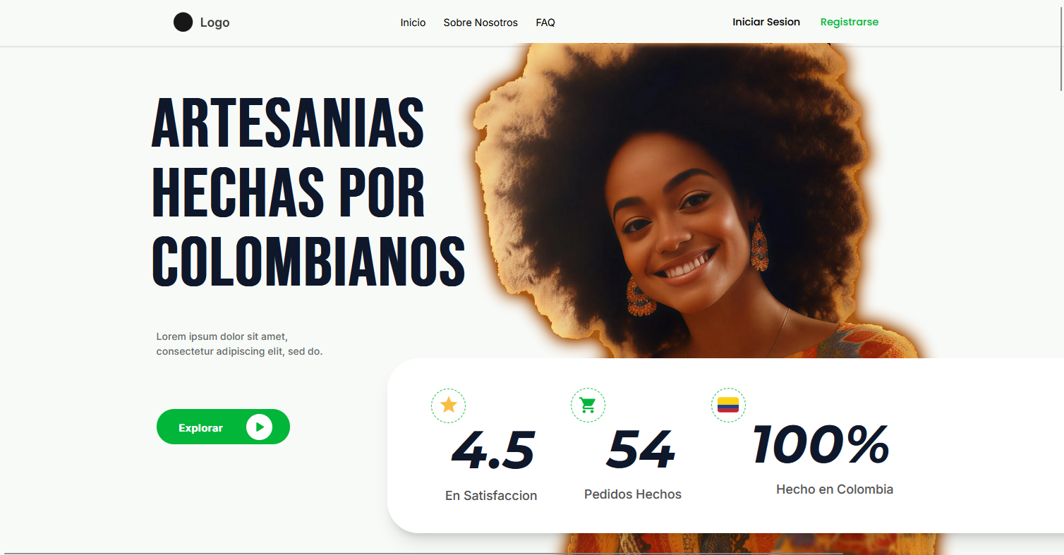
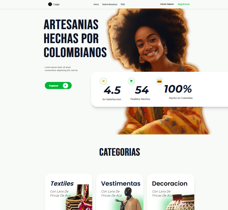
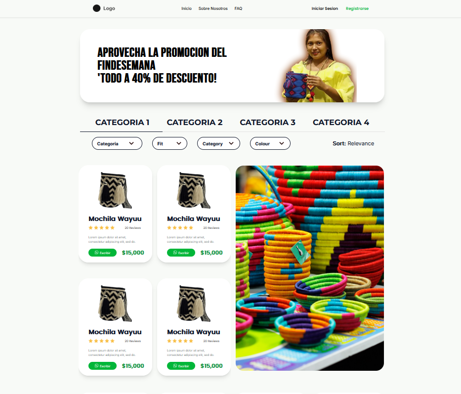
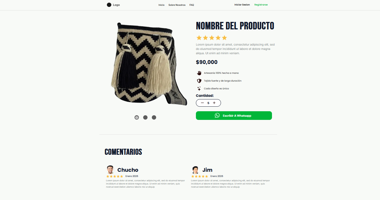
Because the final transaction takes place outside the website, it became important to gradually build understanding and confidence before asking users to take action. The experience begins with a hero section that introduces the brand and establishes context, followed by a product catalog that encourages straightforward exploration.

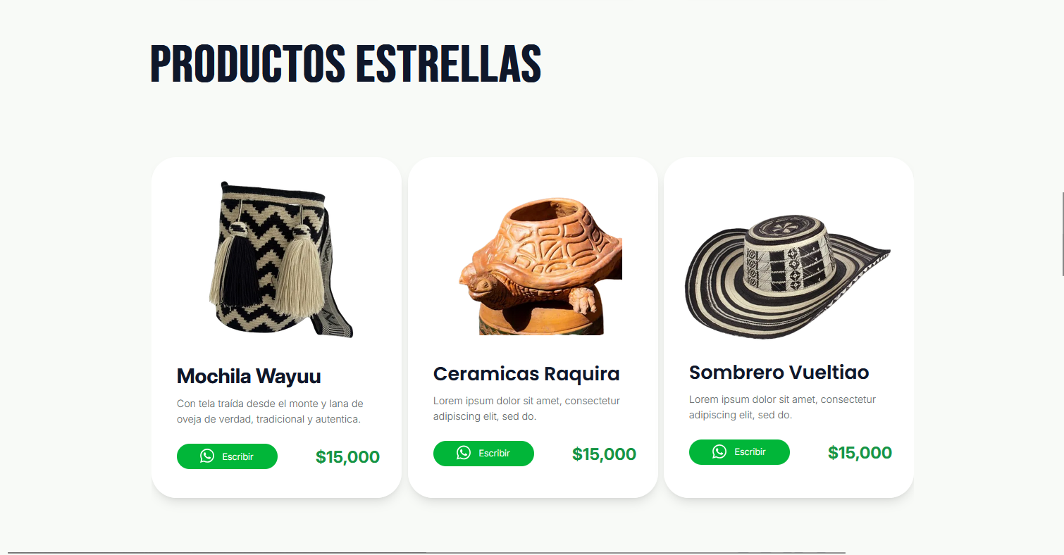
Once a product is selected, the detail page reinforces purchase confidence by providing additional information and clarity around the product itself. Rather than transitioning into a traditional checkout, the experience concludes by guiding users into WhatsApp, with contextual cues introduced throughout the journey to make the transition feel expected instead of abrupt.

By intentionally avoiding unnecessary features and complexity, the structure prioritizes clarity and creates a more intuitive progression from discovery to contact.

Proyecto Artesastore

Design Decisions

🔍

Clarifying the purchase process

Because purchasing continues outside the website, contextual explanations and clearer interface language were introduced to make the WhatsApp-based ordering process easier to understand and reduce confusion around how purchases work.

🎯

Expectation Management

Since the experience does not follow a traditional checkout flow, CTA wording and interface cues were adjusted to better communicate what users should expect after clicking, reducing surprise and hesitation during the transition.

🤝

Trust Building

Because users are asked to continue the process through direct contact, trust became a critical part of the experience. Sections such as testimonials and “Who we are” were introduced to reinforce legitimacy, reduce hesitation, and increase confidence before engagement.

Hero Section

Product Section

About Us Section

Testimonials Section

CTA Section

Catalog Page

Product Page

About Us Page

FAQ Page